Design Approach
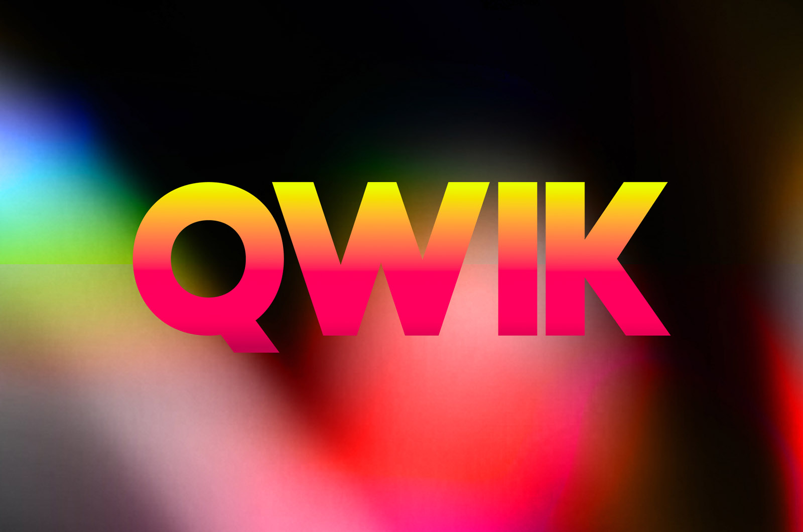
Our design approach for the Visual Identity captures the essence of Qwik with vibrant colours, neon gradients and a bold look that’s synonymous with the image we want to project.
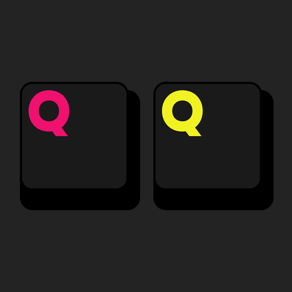
The Logo, with its Brandmark, glorifies the writer’s biggest weapon in today’s time- their laptop, specifically the keypad. This is done with the logo resembling the ‘Q Key’ on a keyboard, thats stands for ‘Qwik’